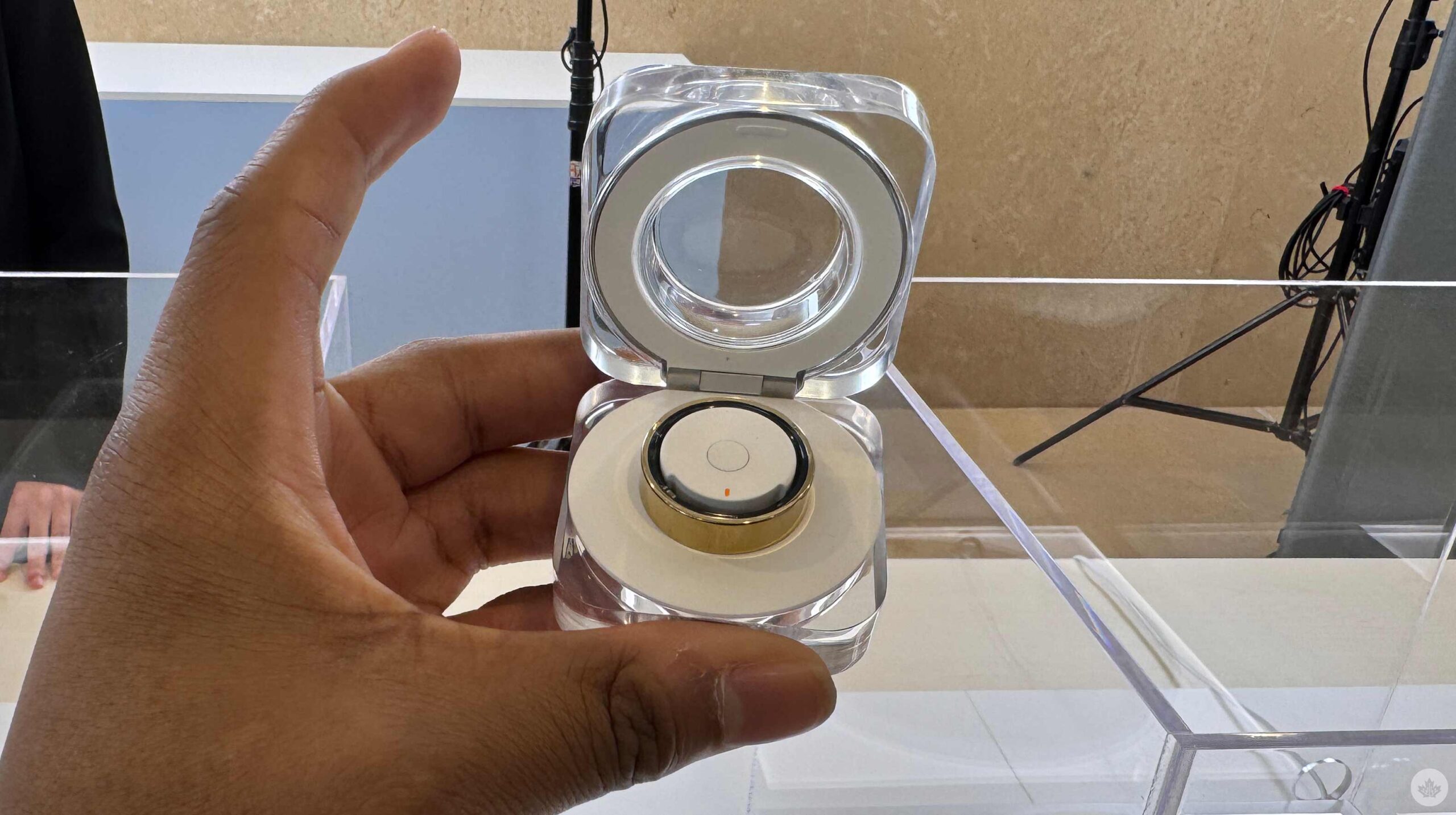
Samsung has been teasing the Galaxy Ring since Unpacked earlier this year and showed it off at MWC, but I never had the chance to put it on. I got the brief opportunity to check out and try on the Galaxy Ring ahead of this Unpacked.
I thought the Ring felt nice; it was lighter than the Oura Ring, which is a smart move for Samsung, considering you should wear the Galaxy Ring while sleeping and working out. However, it felt less like a ring than I was expecting. Perhaps it was too light, and I had to get used to it, but I didn’t have that experience with the Oura Ring. However, the lighter experience is probably for the best. After several months, I got tired of wearing the Oura Ring. I don’t usually wear rings, and the more noticeable a ring, in terms of weight and feeling, the more I want to take it off. So, a lighter ring should make me notice it less, and I won’t mind wearing it for extended periods. Regarding specifications, the Galaxy Ring weighs 2.3 to 3.0g, compared to the 4-6g Oura Ring.
I’ll have to spend more time testing the Galaxy Ring before I can say whether it’s a better option than the Oura Ring.
During my hands-on opportunity, Samsung had a sizing kit that allowed us to try different ring sizes before picking a ring. This is similar to how Oura works: giving users a sizing kit before purchase ensures they get the perfect size wearable. There are nine sizes, ring sizes 5-13, which should fit most people.
The Galaxy Ring has three colour options: Titanium Black, Titanium Silver, and Titanium Gold. It also has 8MB of RAM, is 10ATM/IP68 waterproof, and has a cute charging cradle with a 361mAh battery to keep the watch chugging. The cradle is a better idea than the Oura Ring’s wired charger, but losing the Galaxy Ring’s cradle is probably easier.
Feature-wise, it’ll have a seven-day battery life, be able to access Samsung Health and track your sleep with a sleep AI algorithm and provide a sleep score, which will include metrics like your movement during sleep, sleep latency, heart and respiratory rate and analyze your sleep quality. The Galaxy Ring also checks your heart rate and will alert you if there’s anything irregular. Like the Galaxy Watch, an Auto Workout Detection will track your walking and running and an inactive alert if you haven’t moved.
What’s pretty cool about the Galaxy Ring is its Gestures. By letting people double-pinch (like the Apple Watch), they can turn off alarms or take pictures with their Galaxy phones.
The Galaxy Ring also works with your Galaxy smartphone with Find My Ring on Samsung Find.
The Galaxy Ring costs $399.99 in the U.S., but it’s available for pre-order today and launches on July 24th. I’m looking forward to checking out the Galaxy Ring and playing around with the device, but unfortunately, it won’t be available in Canada at launch. According to Samsung, the device will be available in the North later this year. The Galaxy Ring will also have a subscription, but right now, it’s free.
Keep an eye on MobileSyrup for Canadian pricing and availability.
MobileSyrup may earn a commission from purchases made via our links, which helps fund the journalism we provide free on our website. These links do not influence our editorial content. Support us here.
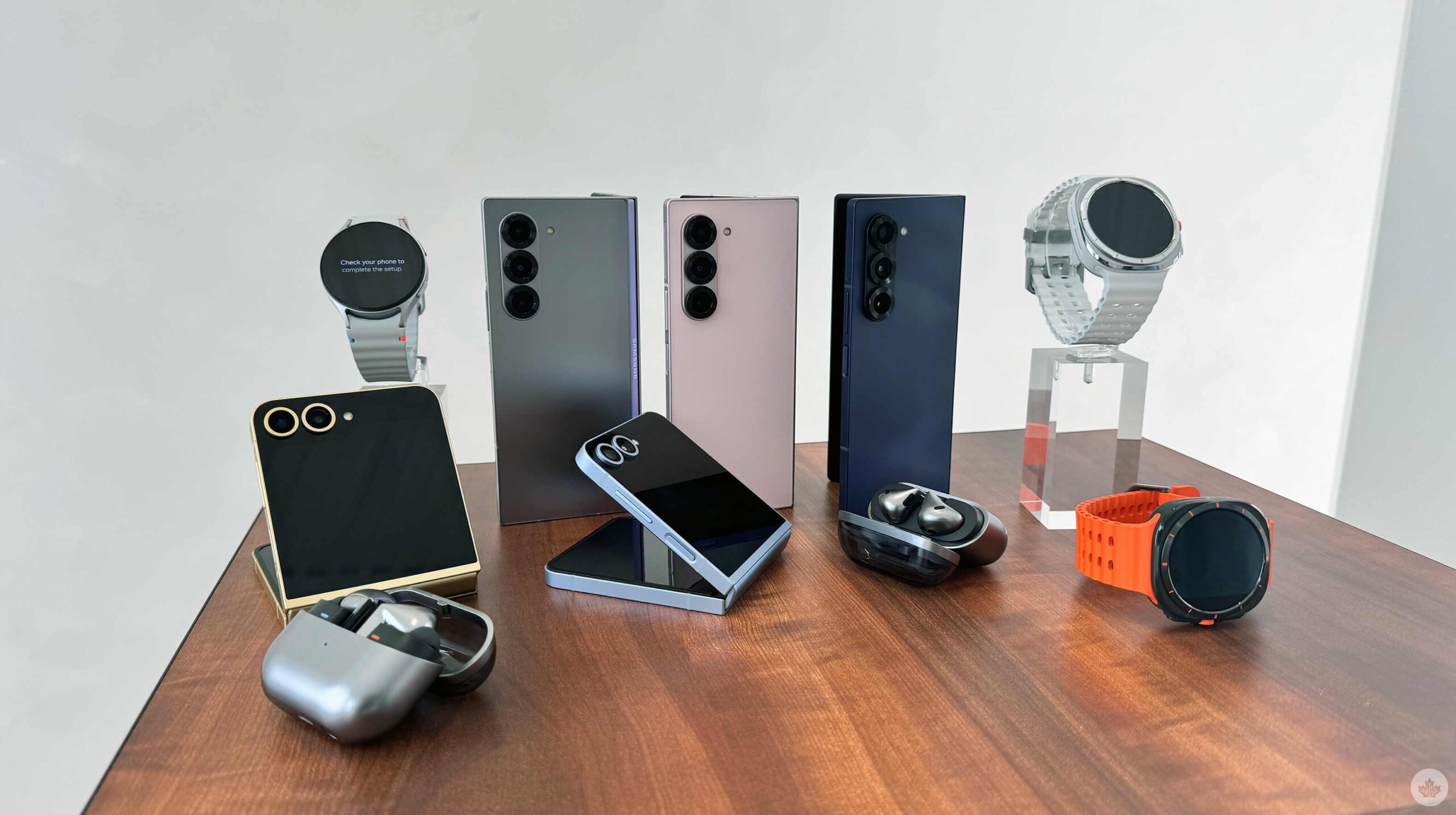
It’s summertime, and you know what that means; it’s that time of year when Samsung unveils its latest foldable at an Unpacked event. Ahead of the event, I got the opportunity to check out the Galaxy Z Fold 6 and Z Flip 6. Both smartphones look primarily unchanged from last year, but closer inspection reveals that the Z Fold 6 has modifications to enhance anyone’s experience. On the other hand, the Z Flip 6’s differences are so subtle that it’s probably the least worthy of your attention out of everything announced today.
The foldable market in North America is slowly becoming more saturated with the OnePlus Open, the Moto Razr, and the Pixel Fold, meaning Samsung has more competition this year. On the flip side, Samsung might lose to the Moto Razr+; I’ll definitely need more time with the Z Flip 6 to see which deserves 2024’s crown, but considering my time thus far with the Razr+, I’m already leaning towards the Chicago tech maker. However, the OnePlus Open is Samsung’s only competition in the fold-like-a-book market — at least in Canada. I hope this year’s Pixel foldable makes it north of the border, but I don’t always get what I want. Either way, OnePlus and possibly Google have a lot of competition in the North with this year’s Galaxy Z Fold 6. Of course, I’ll have to put Samsung’s new foldable through its paces to see how it compares to other 2024 handsets, but in my short time with the device, I can already say that I’m pleasantly surprised.
So small, but so big
Most people probably won’t notice the subtle change to the Cover Screen, but the difference should improve the Z Fold 6’s usability and experience. When folded, the Z Fold 6 is marginally wider but shorter than the Z Fold 5 (1mm wider and 1.5mm shorter) and holy crap, it makes a difference. I remember seeing leaks that the Z Fold 6’s Cover Screen wouldn’t be all that wide, especially compared to the OnePlus Open. And it’s not, as the Open still has the Z Fold 6 beat with a width of 73.3mm compared to the Z Fold 6’s 68.1mm. But despite not being as wide as the Open, the Z Fold 6’s Cover Screen still felt good to use and type on. I also had the Z Fold 5 to compare, and the Z Fold 6’s Cover Screen seemed more usable.
I’m talking a lot about the marginally wider Cover Screen, but the last three Z Fold smartphones have featured the same Cover Screen, so I’m happy there’s finally a change. It could be even wider, but we’re heading in the right direction.
The Galaxy Z Fold 6 is also lighter than its predecessor. The difference is minute, only about 13g, but it’s noticeable and, like the wider Cover Screen, should improve your overall experience. Another design change to the Galaxy Z Fold 6 is its Armor Aluminum frame, which is now flat and matted on each side. It seems like Samsung is moving towards this design element for even its foldable now, as it was previously seen on the S24 series and even some of Samsung’s A series devices. Even though this is a welcomed change because it makes the smartphones easier to hold, it’s odd since the S24 Ultra didn’t adopt this adjustment. I figured only Samsung’s mid-range devices would embrace the flat sides, but I’m not complaining since it’s an excellent addition to the Fold 6.
The wider Cover Screen, flat sides, and lighter body accompany a couple of new colour variants. This year’s ‘hero’ colour is ‘Silver Shadow,’ which offers a carbon silver look. There’s also ‘Pink,’ which provides a pale rosey colour. Lastly, there’s the Navy, which looks dull compared to the other two colour options. The handset’s rear has this excellent matte-like material that feels awesome.
I will enjoy the Z Fold 6 a lot with these adjustments, but I’ll still need to put it through its paces. There’s a downside to the Z Fold 6 as well: Many of its other specs remain unchanged. The Z Fold 6 offers the same camera experience as the Z Fold 5, with the same 50-megapixel primary shooter and 10-megapixel telephoto with 3x optical zoom. Samsung says the ultrawide sensor in the Z Fold 6 is new, but we’ll still need to test it to see if it differs from its predecessor.
It also sports the same 4400mAh battery with 25W wired and 15W wireless charging, which wasn’t bad in last year’s model, but I crave change and upgrades and get disappointed whenever that doesn’t happen.
This is why the Z Fold 6 was a bit of a disappointment for me. Aside from the flat sides the Z Fold 6 adopted, it remains unchanged from its predecessor.
More of the same
The Z Flip 6 has the same 6.7-inch display with a 1-120Hz refresh rate and 2640 x 1080-pixel resolution as its predecessor. It also has the same 3.4-inch Flex Window that uses a 60Hz refresh rate and stops short of the camera bump. It has a different ultrawide sensor, but it’s still only 12 megapixels and only with testing will I be able to tell if there are any significant differences.
There are some quality-of-life updates, like 12GB of RAM instead of 8GB and a 4,000mAh battery instead of 3,700mAh, and even a crease that’s less noticeable, but nothing that jumps out at me and makes me want to recommend this device over the Motorola Razr+. Still, these jumps could significantly improve the experience of the handset compared to last year’s, and before I write it off, I need to put it through its paces and head-to-head with Motorola’s latest flagship. It’s still frustrating that you need Good Lock to take full advantage of the Flex Window, as it’s still mostly widget-based.
The Z Flip 6 comes in Silver Shadow, Mint, Blue and Yellow. Honestly, you can’t go wrong here; all four colours look great, but I’m especially fond of the Yellow, as it sports a lovely yellow-gold metallic frame that accents the device perfectly. While I’m a little tough on the Z Flip 6, I think it’s a solid, well-built device that looks beautiful, even compared to the Moto Razr+.
Follow the stars
Of course, the Galaxy Z Flip 6 and Z Fold 6 come with Galaxy AI and some new features. Galaxy AI uses both onboard and cloud-based AI powered by Qualcomm’s Snapdragon 8 Gen 3 and Samsung’s Gauss Language and Gauss Image models, as well as third-party features like Google’s Circle to Search. One of the new features allows users to sketch on the Z Fold 6 with a stylus and then have Galaxy AI make a picture out of the sketch into different styles, like a 3D cartoon. It worked well, and during my demo, the Samsung employee sketched a bearded French man. Galaxy AI made the rough sketch look precisely like a Pixar character, which was cool. However, I can’t see many people using this feature.
A Galaxy AI feature I could see being useful was the combination of Galaxy AI and Circle to Search, allowing users to take a picture and pull up Circle to Search, which now includes a ‘Translate’ icon. You’re able to translate any words in the photo. I will likely use this feature because I’m currently in Paris at the Unpacked event and heading to Milan afterwards. Another worthwhile functionality allows users to take a picture of math equations, and the handset will not only solve the equation but also show you how to solve the equation. Considering my mathematic skills are abysmal, this can be useful, but this is especially great if you’re trying to teach your kids math problems. Another feature that made its way to the Z Fold 6 and Z Flip 6 is a Notes AI functionality that lets users record audio directly from the Notes app. The handset will record, transcribe and summarize the audio all in the Notes app.
Galaxy AI Assistant?
Google, Apple, and Motorola have announced new AI Assistants to make our lives easier. I expected Samsung to announce something similar to Gemini Live or Apple Intelligence, but it was absent from the company’s presentation. Perhaps Samsung will utilize Google’s Gemini Live when it becomes available — this seems likely, considering how quickly Samsung was to adopt Circle to Search. However, without any mention, it would be interesting to see how Samsung competes with Apple and Google. I 100 percent expected Samsung to announce some enhanced form of its Bixby assistant; however, the company hasn’t announced a new feature for Bixby in a few years.
We may see a new personalized assistant at the launch of the Galaxy S25 series. Google’s Gemini Live, Apple Intelligence, and even Moto AI won’t be ready until late 2024, so Samsung might wait until the S25 series launches in early January before launching its version.
More to see
The Samsung Galaxy Z Fold 6 and Z Flip 6 are flagship-quality devices, and I’m looking forward to putting the Fold 6 through its paces. However, I’m slightly less excited to review the Z Flip 6. I’m a sucker for gimmicks and new updates, so the Z Fold 6 and its wider display, lighter body, and better design are gripping and thrilling, even. However, the Z Flip 6, on the other hand, doesn’t offer anything this year that I find exciting. Still, with the changes in quality of life, I’m interested in seeing whether I find any significant differences in how I use the device, especially compared to last year’s handset.
The Galaxy Z Fold 6 costs $2,564 CAD, an increase from the Z Fold 5, which costs $2,399. At face value, even with all the upgrades, I can’t say whether the Z Fold 6 is worth the price increase, but I’m interested in finding out. The Z Flip 6 also increased to $1,462.99 from $1,299. Again, I can’t say if this price increase is worth it without putting the handset through its paces, but considering it mostly received quality-of-life updates, I doubt it.
I love foldable smartphones, so I will spend a lot of time with both handsets, especially the Z Fold 6. I’m curious to see whether the wider screen is enough to make it stand out against the OnePlus Open. I would also like to see if the Z Flip 6 can compete against the Moto Razr+. I’ll put both handsets head to head to see which is the better option for Canadians to purchase. But it’s worth noting I recently put out my review for the Razr+ and gave it a 9/10.
In Canada, the Z Fold 6 dominates in the phone-to-tablet foldable market, and we expect it to keep its crown, but only time will tell.
The Z Fold 6 and Z Flip 6 are available for pre-order now and go on sale July 24th.
MobileSyrup may earn a commission from purchases made via our links, which helps fund the journalism we provide free on our website. These links do not influence our editorial content. Support us here.
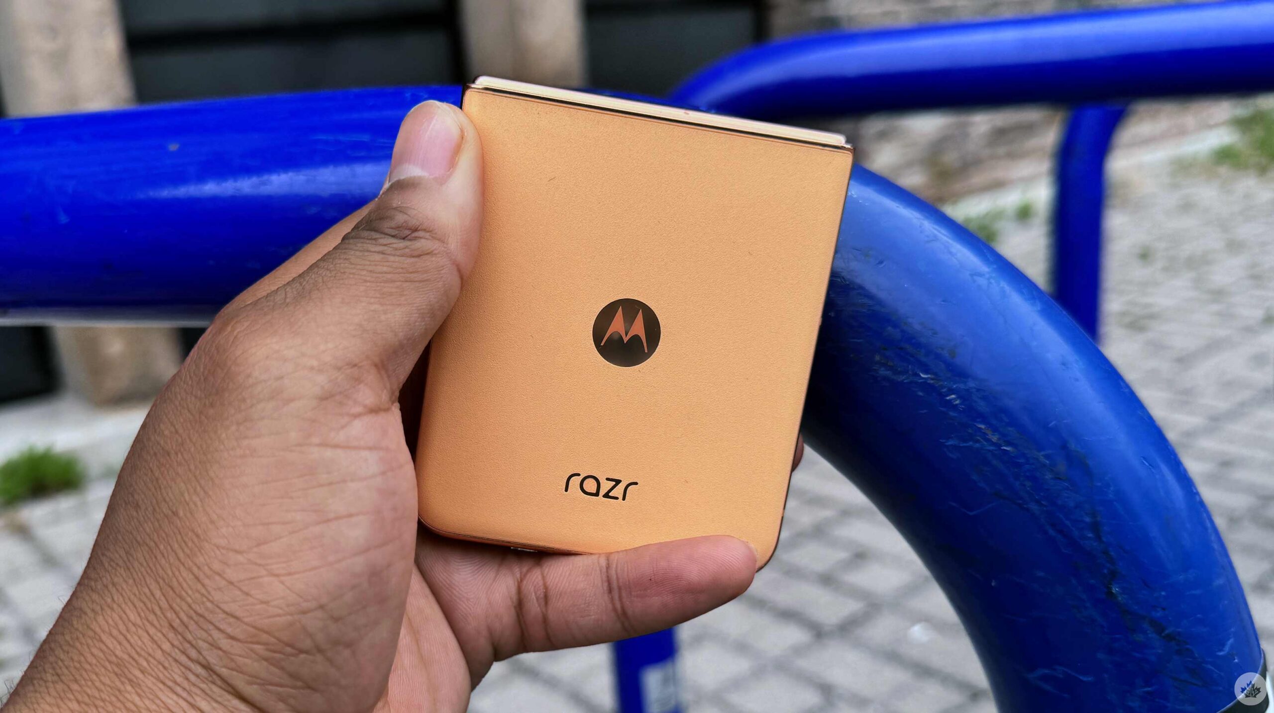
After several years, I’m finally ready to recommend a foldable smartphone to all Android users. Last year’s Motorola Razr+ was an awesome foldable handset, but this year’s Razr+ is simply an awesome smartphone.
Of course, I’m a little biased. I’ve said numerous times that I love folding phones and gimmicks in general. However, my enjoyment for folding phones typically doesn’t extend to the clamshell foldable handsets. Last year, my favourite phone was the Pixel Fold; the previous year, it was the Galaxy Z Fold 4. Both of these devices fold like a book, a form factor I absolutely love. I’m not typically fond of clamshell handsets like the Razr and the Galaxy Flip, as I don’t find this form factor as useful. However, despite my disinterest in the form factor, the Razr+ is a well-built device with top-of-the-line specs that make it a suitable Android.
Exquisitely built
The Razr+ is well-built, even better than its predecessor. The handset feels solid, and while I thought the Razr+ 2023 had a strong build last year, I can immediately feel the difference. I thought the Samsung Galaxy Z Flip 5 felt even more premium than the 2023 Razr+, but this year the Razr+ matches that flagship-like build.
The handset has a dual-hinge system, which Motorola says is simplified, revamped, and offers better dust protection than last year. The revamped hinge also makes it easier to flick open the device, and hanging it up feels much more satisfying.
Motorola gave me the Peach Fuzz Razr+, a fuzzy vegan leather material. Strangely, it has a slightly different feel than the other colour variants. The aluminum frame around the handset offers a gold/bronze-like finish, making the smartphone look elegant and lavish. At first, I wasn’t a big fan of this colour variant and preferred the green model, but I am starting to enjoy it more, especially since I’m rewatching Gossip Girl and want to feel like a rich Upper East Side girl.
The frame also hosts a power button that doubles as a fingerprint scanner and a two-button volume rocker.
When you open the handset, you’ll see a wonderful 6.9-inch display with a 1080 x 2640-pixel resolution, up to 165Hz refresh rate, and an astonishing 3000 nits of brightness. Plus, the smartphone only weighs 189g.
This year’s Razr+ is now waterproof with an IPx8 rating. This is awesome; now you don’t have to worry about your Razr phone when it’s in the rain if it drops in the toilet or anything. Last year’s Razr was only IP52, so this is a pretty big and worthwhile update.
Largest front screen
Motorola retains its position of having the largest cover screen of any flip phone in North America, with a surprisingly usable 4-inch display. It’s slightly larger than its predecessor, but the extra space gives it a better typing experience. During this review period, I tried to use the handset in a way that felt the most natural. Therefore, I didn’t force myself to use the cover screen in any special way, like last year. With this in mind, I still used this secondary display more than expected.
Firstly, Motorola brought an always-on display to the phone’s cover screen, meaning even with the phone closed, I’d know the time, weather, date, battery percentage and any notifications. This isn’t anything special, as nearly every phone on the market has an always-on display; however, it’s a little step in the right direction for making the Razr+ an all-around great Android device for anyone. I also occasionally like to have the phone propped up like a tent to keep track of the time with a literal glance instead of having to look at my phone placed on the desk. Obviously, this isn’t very important, but I noticed it.
Otherwise, the front screen is great for reading notifications, quick replies to messages, lazily scrolling through Instagram or YouTube and using Google’s Gemini. I also have the Calendar widget, so I can’t take a quick glance at what’s going on during the day, and I can quickly change and pick songs with the Spotify widget. Similar to last year, there are games that I barely touched on the cover screen. The 2024 models also have a screensaver functionality and are more customizable than their predecessors.
The most useable cover screen feature is taking selfies with the handset’s primary shooter. I love taking selfies with the phone’s better cameras instead of using the front-facing shooter. Of course, this isn’t exclusive to the Razr+ and can be done on all foldable phones, but it’s still important to mention.
Speaking of cameras
I was pleasantly surprised by the primary and telephoto shooter on the Razr+. This year, Motorola chose a 2x telephoto instead of an ultrawide. I’ve always preferred a telephoto experience to an ultrawide, but a 2x telephoto just isn’t enough. 2x telephoto shooters are specifically designed to help with portrait photography, which is nice, but I’d definitely prefer a 5x zoom. And surprisingly, I’ve been finding myself needing an ultrawide shooter far more than I expected.
Despite lacking an ultrawide camera and only sporting a 2x zoom, I was pleasantly surprised by the Razr+’s camera experience. I’m sure other reviewers will say that the base 2024 Razr’s camera is better than the Razr+’s, and I’ve seen proof of this; however, there are two caveats.
1: This experience isn’t consistent. When my friends compared the pictures of both handsets, I found that the Razr sometimes took better pictures, and other times, the Razr+ snapped preferable shots. The Razr+’s photos looked better when shooting people, but it looked like the Razr had more accurate colours and high dynamic range.
2: The base 2024 Razr doesn’t have a Canadian release date or availability, so who cares?
Let’s get back to the Razr+’s acceptable camera experience.
I’ve seen better camera experiences from the S24 Ultra and even the Pixel 8 Pro, but Motorola definitely enhanced the Razr+ cameras by replacing the old sensor with a 50-megapixel sensor with an f/1.7 aperture. Pictures showcased a good amount of dynamic range and showed plenty of detail, and even in low light, the handset did a decent job of capturing shots. I thought some shots were overexposed, especially when taking selfies of my darker skin tone, making it slightly lighter than I would have wanted.
If you’re someone like me who likes taking casual pictures and sharing them online, then the Razr+ is definitely good enough, especially if your main hobby isn’t photography.
Video-wise, when you fold the handset at a 90-degree angle with the camera app turned on, it will automatically switch into camcorder mode and start recording a video. I loved taking videos in camcorder mode, and my videos of my friend’s Pride performance came out great.
Razr is back, baby
The Razr+ sports a Snapdragon 8s Gen 3 processor, 12GB of RAM, 256GB of storage, and a 4,000mAh battery. I haven’t had too many issues during my experience with the device. It moves snappily, gets all my tasks done, and doesn’t get noticeably warm. Multitasking makes the phone chugging on a little bit harder, especially when I have an app opened in a pop-up window and use other apps in the background.
Benchmark-wise, the Razr+ isn’t all impressive. Its Snapdragon 8s Gen 3 processor achieved a single-core score of 1,876 and a multi-core score of 4,389, similar to the Tensor G3 on the Pixel 8 series. However, it doesn’t stand up to the 8 Gen 3 on the Galaxy S24 Ultra or even the overclocked Snapdragon 8 Gen 2 on last year’s Z Flip 5. Benchmarks don’t necessarily equate to a better experience, but this might explain why there’s a bit of a slowdown when multitasking.
Battery-wise, the Razr+ 4,000mAh power source is adequate. It gets through the whole day without an issue. Even when taking pictures, I listen to music and watch YouTube videos. But don’t expect anything more than that single day. By nighttime, the handset will be dead and must be charged.
Something cool about the Razr+ is that it comes with Google’s Gemini straight out of the box, alongside three months of Gemini Advanced for free. I’m still unsure if Gemini is a suitable replacement for Google Assistant, but when it is, the Razr+ will be ready.
MobileSyrup may earn a commission from purchases made via our links, which helps fund the journalism we provide free on our website. These links do not influence our editorial content. Support us here.
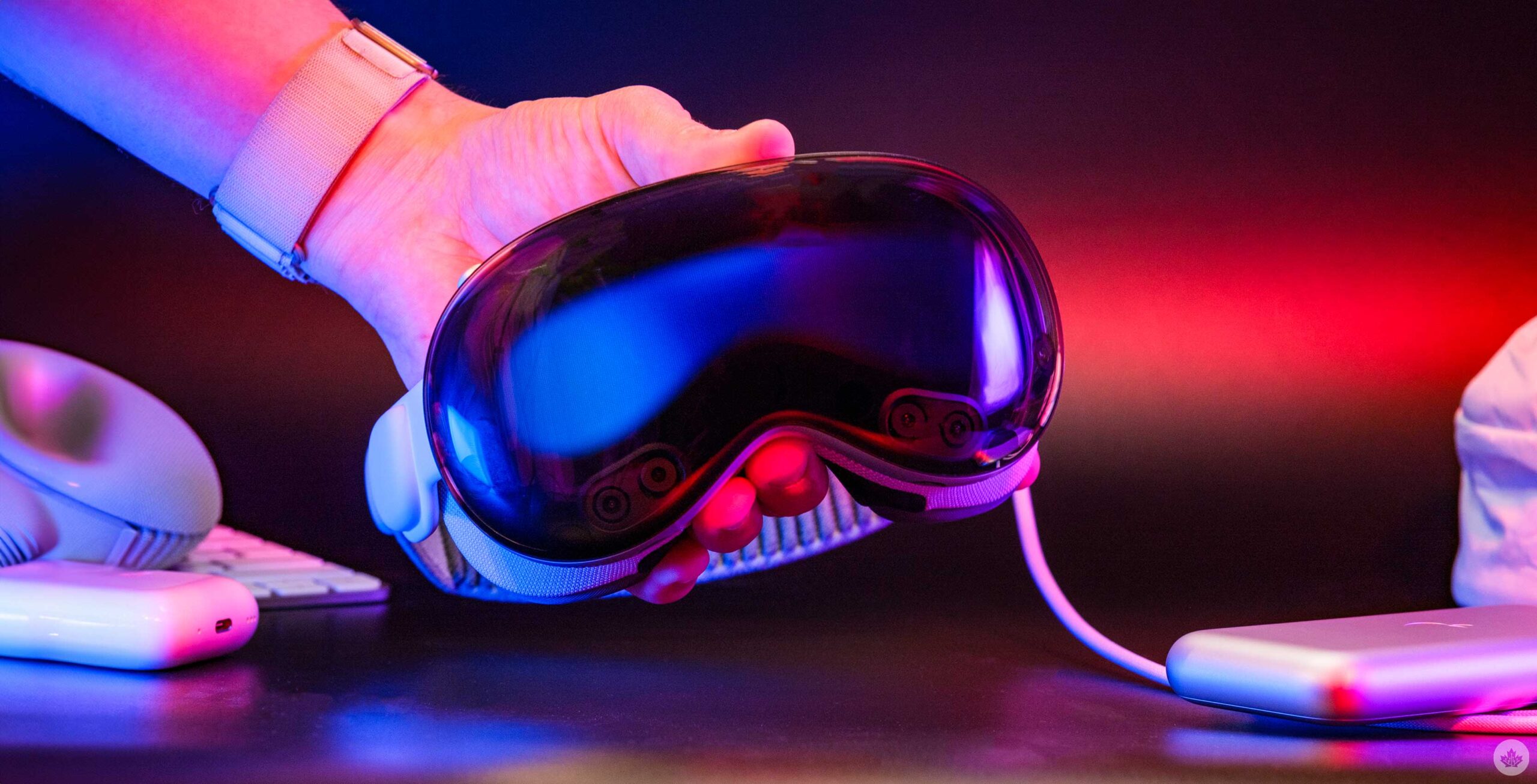
Apple is showing us how it views the future, and after six days of testing, I’ve nailed down some of the key concepts that make this the most important computer to hit the market since the iPhone. If you want to live in the future today, the Vision Pro will take you there.
The experience of using the headset is magical. The first few days are filled with jaw-dropping moments like just how good the eye tracking system is, and the scale are two things that I still struggle to describe to people since they’re better than I ever could have imagined. And don’t even get me started on the digital shadows your windows cast in the real world. The Vision Pro is Apple at its best, and It’s an amazing amalgamation of Apple’s headlining software features from the last few years. When it all comes together, it feels so natural and easier to use than I expected.
There are flaws, and as a computer, it’s not perfect yet. Like all new platforms, it needs a little more time to mature and spin up an app ecosystem. You can do a lot through a mix of Vision, web, and iPad apps, but there are still a ton of tablet apps that aren’t on the platform, which limits its use cases for some.
Having said that, as I’m writing this, I’m sitting on my back porch in Toronto with just the headset, a trackpad and a keyboard. When I glance above my Microsoft Word window, I see the stunning sunset of Haleakalā in Hawaii, I feel a real breeze and I see real trees beside me, and I can’t help but be amazed at this portal into another world.
So what have I been doing in here?
I’ve had the headset for a little less than a week by the time you’re reading this, and I’ve been using it as much as I can. On my third day, I even clocked a little over ten hours with it on. I spent the workday just writing and editing photos with the help of Mac Virtual Display. Then, after work, I had a two-hour FaceTime call with Drew Kozub where we played chess and marvelled at our Personas, and at one point, while sitting in a virtual theatre, my leg grazed my desk, and my brain told me, “That’s Drew’s leg.” It was a weird experience, and really just the tip of the iceberg when it comes to the Vision Pro.
Circling back to work, it’s tempting to pull over my MacBook and use Mac Virtual Display when I’m trying to be productive. It works awesome when it’s bug-free, but a couple of times, I’ve had to restart my computer and headset to get them to connect properly. That being said, I only really use it for Photoshop, and offloading media from my camera. In theory, I’ll use it someday for Final Cut Pro, too, since those apps are unlikely to make their way to visionOS any time soon.
I spent a vast majority of my time in VisionOS. This means I’ve been writing in Vision apps like Notes and Microsoft Word or web apps in Safari like WordPress and Google Docs. I started in Notes and then moved to Word for most of this review. When I was writing news blogs, I just wrote in WordPress. At the end of my experience, I found myself using Google Docs in Safari for its familiarity and since that’s what we normally use to share documents at work. I do still like using Microsoft Word, but that’s mostly because it’s a nice-looking visionOS app. I don’t really like paying for an Office365 subscription, so I’ll be back in Docs soon enough. I’d love for Apple to bring over a visonOS version of Pages soon to give users a free and robust word editor without having to use the iPad version. Until then, I do think there’s a big gap in visionOS that a third-party dev could fill.
When it comes to photo editing, there are even fewer apps to choose from. To edit a photo from my Fujifilm camera, I need to either transfer the photo with the janky old iPad app (1.3 star on the App Store) or use Mac Virtual Display. There is a new Fuji app, but the company hasn’t opted to allow it on the headset. This means I pretty much had to choose Mac Virtual Display since it allows me to use accessories like an SD card reader and apps like Photoshop. There are a few photo editing apps on Vision Pro, but they’re nowhere near professional yet, and most are more for photo retouching than serious editing. A photo editing app will likely come someday, but the main hurdle is that getting files into the headset is borderline impossible. The only way to transfer is to use the cloud or AirDrop. It seems very strange to me that Apple didn’t design the battery to act as a USB-C port for accessories.
Despite those hiccups, working in this thing is a vibe. I’m able to stack up four chat apps to my left, I have a cool agenda app called Glance Bar beside that, two web browsers in the middle, and Photos or other apps I might use rotating out to my right. It looks a little cluttered in screenshots, but once you’re in it, it’s perfect. You get to tailor the experience to be exactly what you want, and it’s really powerful. Want to focus on writing? Just drag that window up into your primary view and size it however you want. It’s hard to describe, but I find it easy to get into a flow when I immerse myself in the visionOS working environment. Something about the giant windows and the peaceful atmosphere really helps me shy away from distractions. Add in a pair of AirPods Pro with noise-cancelling enabled, and I challenge anyone not to get lost in this world for at least as long as it takes for the device to become uncomfortable resting on your face.
As expected, the Vision Pro is just like Apple’s other computing products and acts similarly in terms of software control. CMD+Space still opens universal search, there’s a Control Centre, the predictive text bar from iOS is here, and the home screen is pretty similar. I wish there was a CMD+Tab shortcut that would swap out the app that’s centred in your view, but having everything floating in front of you makes multitasking fairly straightforward anyways.
I just recently removed the monitors from my desk so I can go Vision Pro only and it looks so clean I’m in love with it.
These things all make the headset familiar to use, but it’s the software connectivity features that really go the extra mile. Cloud copy and paste that launched a few years ago make Virtual Display feel like it’s really part of visionOS, even if you can’t really drag and drop files between the Mac and Vision just yet. Mac Virtual Display itself uses Continuity keyboard to make using your Mac’s keyboard work in the rest of visionOS. Throw in SharePlay, AirDrop and all the AR improvements Apple has added to iOS over the years, and it all adds up to a really powerful computing experience that feels closer to Tom Cruise in Minority Report than it does to using a MacBook, yet it’s just as familiar to use as the MacBook or iPhone you’ve been using for years.
What about entertainment?
Beyond doing my best to do my regular writing job, I’ve also been testing out as many apps as I can and playing a few games. Thankfully the iPhone version of Delta works here, so I’ve been able to gear up for the Elite Four while sitting in a virtual theater or on top of a mountain. There are some native visionOS games, but nothing that feels super ahead of its time yet.
I think most people will be able to find some sort of game they like, but right now it reminds me of the early days of the iPhone and iPod Touch. There are lots of games, but most of them seem built around a single control scheme or concept. Think Angry Birds and Cut the Rope. I have faith that more things will come, but so far, the most exciting game I’ve played was a 3D puzzle game called BlackBox that uses the sensors in the Vision Pro to make you solve puzzles by doing actions in the real world, like jumping and spinning. You can even shrug to get a hint and all the levels float around you in 3D. However, if it wasn’t so puzzling, I’d call it an experience more than a game.
So while I hope some cool 3D games come soon, I’ve mainly used my time in the headset to play traditional 2D games. Mainly, this has been Pokemon on Delta, a little bit of Oceanhorn 2 and Warped Kart Racers. None of these games get a huge boost from being played in the Vision Pro, but since you can pull up multiple giant screens, it’s really nice to throw on some TV or a YouTube video and then play your games at the same time. You can also stream in Steam games with the Steam Link app and it works decently well.
Watching movies and TV shows is also pretty extraordinary, but you will have to get used to the weight of the device on your face before you can get comfortable watching a long film with the headset on. When you choose to watch something on the headset, you have three formats to choose from – standard 2D, 3D and immersive content.
Right now, there are only a few immersive demo experiences, but Apple shared at WWDC that it’s working on an immersive short film, and Red Bull is also shooting more action sports in the new format. The videos I’ve seen this way are really cool, but I’m hesitant to say it’s the future of movies or TV since it requires the user to participate and look around so it won’t work for more guided storytelling. Live sports, on the other hand, makes a lot more sense for this viewing format, and I think being able to be courtside at a tennis match or floating above the net at a hockey game is a really awesome experience that a lot of people would be willing to use a headset for. There is an immersive Alicia Keys studio experience demo where she sings a few songs into the camera and it’s really incredible. This isn’t a full movie, but when you watch it, you really feel like you’re in the room watching her perform from three feet away, and it’s surprisingly captivating. I hope more music videos or concerts also use this format since it’s a cool way to be inside a recording studio and listen to a performer in a perfect environment.
3D movies get a nice boost in the headset too, but since modern movies are shot in stereoscopic 3D to add depth, they do feel similar to how they would when you watch them in a theatre. If you like 3D movies there, I think you’ll love them even more here. That said, as a fan of 2D movies, I was curious to see if the headset might sway me to like 3D more, but so far, it hasn’t. Animation, like the Mario Movie or CGI-heavy movies, like Avatar 2 both look really cool, but at the end of the day, I would still rather have the flatness of a regular screen for movies. If more movies started using 3D effects to pop things out of the screens, I might be tempted back, but since most just provide more depth, I often find it distracting from the frames composition.
Honestly, it’s a really great movie-watching experience, and I have been able to fall asleep wearing it twice now, but you can’t watch movies in the bed in the dark, which is really annoying. Since the device needs light to hand track you, it pauses your movie to warn you whenever you become fully enveloped in darkness. People online seem to combat this by using an infrared light near their bed, but I’d rather Apple develop some kind of nighttime mode that would allow us to watch movies without needing a light nearby that we’re going to block out with a virtual environment anyways.
The best hardware possible?
This headset looks stunning and it even manages to look kind of cool when you’re wearing it with the Solo Knit band. The mix of metal, glass and the intricate sewing work make the whole package look really futuristic, and premium. It might not offer the exact look of ski goggles like I thought it would, but it’s really close and secretly, I feel like a character in a sci-fi movie every time I put it on.
Even taking it apart feels cool with those smart orange pull tabs to remove the band and magnets to take off the light seal and the face cushion. Once it’s disassembled you can clearly see how small the device actually is, yet that still doesn’t save it from being a little bit too heavy.
Don’t get me wrong, it’s very wearable, but if Apple can find a way to make it lighter, I think that will go a long way towards making it a more viable computer replacement.
That said, the more I wear it, the better I’ve been getting at adjusting it to keep it comfortable. I still can’t wear it all day, but I could easily go for a few hours without needing to take it off. Basically, I’ve found that instead of adjusting the headset itself, I can pull the band up or down in the back ever so slightly, and it will help move the pressure off my forehead or cheekbones. Even loosening the strap for a few minutes can really help the pressure dissipate if you’ve been wearing it for a long time. And while there might be some discomfort, I often find that I only need a quick 5-10 minute break before I’m ready to dive back in.
I wasn’t that worried about the weight before I got my hands on the Vision Pro because I really thought that another lighter option would soon follow, but now that I’ve spent more time using it, it’s become apparent that it’s already really small. Sure, you could remove the Eyesight screen and the glass from the front, but there isn’t much actual metal on the device to replace with something lighter, and at this level, aluminum isn’t that heavy. Maybe more carbon fibre needs to be used, but cutting the device’s weight down from 600 grams to that magical 300-gram sweet spot seems impossible right now. Perhaps another 100 grams could be shaved off, but I do worry about how quickly Apple can reduce the size and weight of the Vision line, and how necessary that will be for mass adoption.
When you look past the weight you get to see this device for the engineering marvel it is. Everything just looks great and even the cover that’s included with the headset matches the band and looks awesome when it’s all packed up. The all-metal battery and extra travel case are also both extremely nice, even if the case does leave a lot to be desired in terms of functionality. The battery life also only goes a little past two hours which does feel rather limited. It’s not too bad in actual use since most of the time you use the device you’ll be sitting at a desk or on your couch, but in the future if Apple could double that up to four hours that would make it a little less stressful to use away from home.
Building the base
The real star of the show is visionOS by a mile. While the hardware is really great, it’s the software that pulls it all together and makes the experience look, and feel, like the computer of the future. For this review, I’m running visionOS 1.2, but Apple has shown off visionOS 2 so I didn’t hit on a few things in this review that annoyed me, since they’re already on pace to be fixed in the fall. That all being said, visionOS 1.2 is pretty bare-bones for now, but it works, and the fact that I can just put on a headset and do my job still blows my mind. Realistically, I need at least a keyboard and trackpad too, since I write, but again, just the fact that it’s possible is really cool.
At the end of the day though, it reminds me a lot of the early days of iOS. A good example of this is the battery settings page. On iOS, you can see your battery health, recent charges, what apps are using the most juice, and so much more. On visionOS, all you can do is toggle the percentage indicator on and off. This isn’t a huge deal, but it’s a good example to illustrate how immature visionOS is next to Apple’s other operating systems. It has a solid base, but now it needs a few years of people actually using these devices to really help Apple bring them up to par with its other operating systems.
In the future, I’d love it if we could stack multiple apps within the same floating windows. Being able to dedicate a window to chat apps and then being able to swipe through them, like iOS multitasking, would be really helpful. While it’s cool to have a bunch of apps floating around you, realistically, I usually use three at a time. That maxes out what I can easily look at without moving my head too much. I can stack another three above that for six, but that involves a lot more looking around the virtual/real space.
Being able to run Mac or web apps would also help fill in the gaps as more developers start creating things for this platform. I get that most apps like that aren’t set up for touch/spatial computing, but being able to use an app, even if I need to connect a trackpad, would be better than not being able to use it at all.
The other form of software I’d love to see is a stronger form of multitasking. I’ve alluded to it above with stacked windows and CMD+Tab, but beyond that, some form of App Exposé from Mac might be helpful here too. Often I‘ll try to open an app only to find it floating where I left it outside or in another room, making it hard to grab and bring back to me. You can hold on to the Digital Crown to re-centre all your windows around you, but honestly, this doesn’t work as well as you’d want it to and often just moves your windows slightly. Being able to see everything I have open in a grid and then choose which window I want to pull down into my workspace would be way more convenient. Even having an app dock accessible via a gesture would be cool and a fast way to swipe through your favourite or recently used apps.
Right now, when you open an app, you can sometimes close it with a small ‘X’ at the bottom of the window, but I’ve found that not every app actually closes, and many just minimise in the background. This forces me to open the force quit menu a lot to close out apps that aren’t being used anymore. Having a way to distinguish between closing an app and minimizing it would also be really handy in the future.
Beyond all of that, the thing that I think about the most is just how different and fresh visionOS looks compared to iOS or macOS. There’s a cool fogged glass effect on most windows that looks awesome and adapts to your environment. For example, if I hold the Email app up in front of a yellow wall you can see the yellow through the fogged glass effect. If I take it outside and hold it in front of a bush, it shows green.
The other thing that really makes this experience great is the sound design. It is incredible, and all the small blips and boops that sound off as you navigate visionOS really takes the experience to the next level. Things get even crazier when you FaceTime someone else in a Vision Pro too. The headset can nail the directionality of sound so well, it really feels like you’re in a room with someone. At one point, I was FaceTiming with Drew Kozub from Breakfast Television, and when we turned on the White Sands immersive environment, it isolated our vocals and made it sound like we were talking outside. Before that, I was just sitting in my office, and the audio was tweaked to add the slight reverb you might get from sound bouncing off walls in a small room. It was a really cool effect, and while the Personas go a long way toward making these calls feel more human (the eye and face tracking is really good), the sound design really sell it.
MobileSyrup may earn a commission from purchases made via our links, which helps fund the journalism we provide free on our website. These links do not influence our editorial content. Support us here.
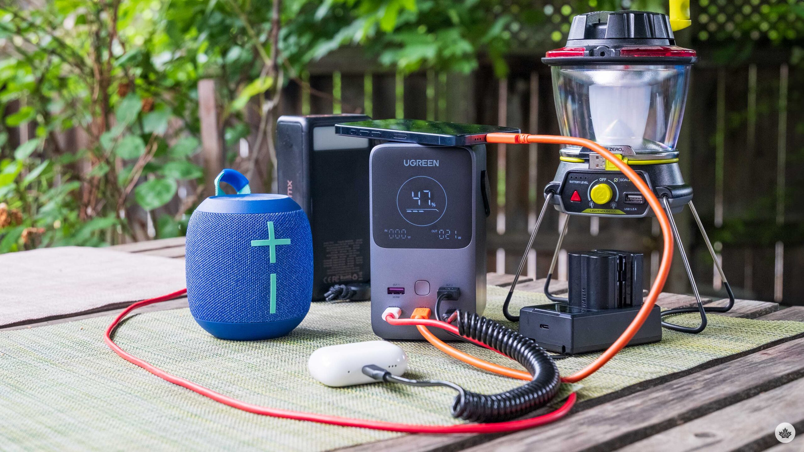
I’ve been hunting for the perfect battery to use for 3-5 day camping trips and the latest brick from UGreen is pretty much perfect.
There isn’t a lot you need from a battery, but over the years UGreen has been able to learn from its extensive product line to really hone down what people will use when travelling, and they’ve added it to this new power pack.
Right from the get go it’s a 48,000 mah battery, which means you can charge MacBooks, iPads and most importantly, your phone over and over again. For modern iPhones you should be able to get 10.5 charges out of this battery, according to UGreen, and in my testing that adds up. However, when it comes to devices with a larger battery like a 15-inch MacBook Air, you’ll get a little more than a single charge from the battery.
That all said, When camping I really only charge my phone, maybe my watch and maybe a speaker or iPad, which this battery can handle perfectly. UGreen also says it should hold its max charge for a long time and should go down 80 percent battery capacity after 3,000 charges.
As you’ve likely noticed in the photos there’s a really nice matte display on the front to show reamaining battery life and the input/output wattage. For charging it can take a max input of 140-watts which tops up the unit in about an hour and a half. In terms of output power it can supply 200-watts, but split across multiple ports. There is a USB-C port that can output 140-watts, but the other two only do 100-watts. The USB-A ports are rated to do 22.5-watts.
On the side there’s also a small light strip that’s bright enough to light up a small area, but it doesn’t replace an purpose built lantern. That said, it comes in handy when you’re trying to plug things in when it’s dark out.
Overall, its a pretty compact charging brick for its wattage and I’ve had really great experiences with it so far. There is even a little handle on the top that make it easy to tote around if you’re charging your phone. Another small thing that I like about it is how stable it is. I have another battery that I bought last summer that has a similar power rating, but it’s a longer rectangle so you need to lay it on its side to make it feel stable. It’s a small thing, but when it comes to use, the UGreen option has a smarter design that’s more approachable.
You can buy the the power bank on Amazon.ca. It’s price is 199 USD (roughly $271 CAD) however it’s currently out of stock.
MobileSyrup may earn a commission from purchases made via our links, which helps fund the journalism we provide free on our website. These links do not influence our editorial content. Support us here.
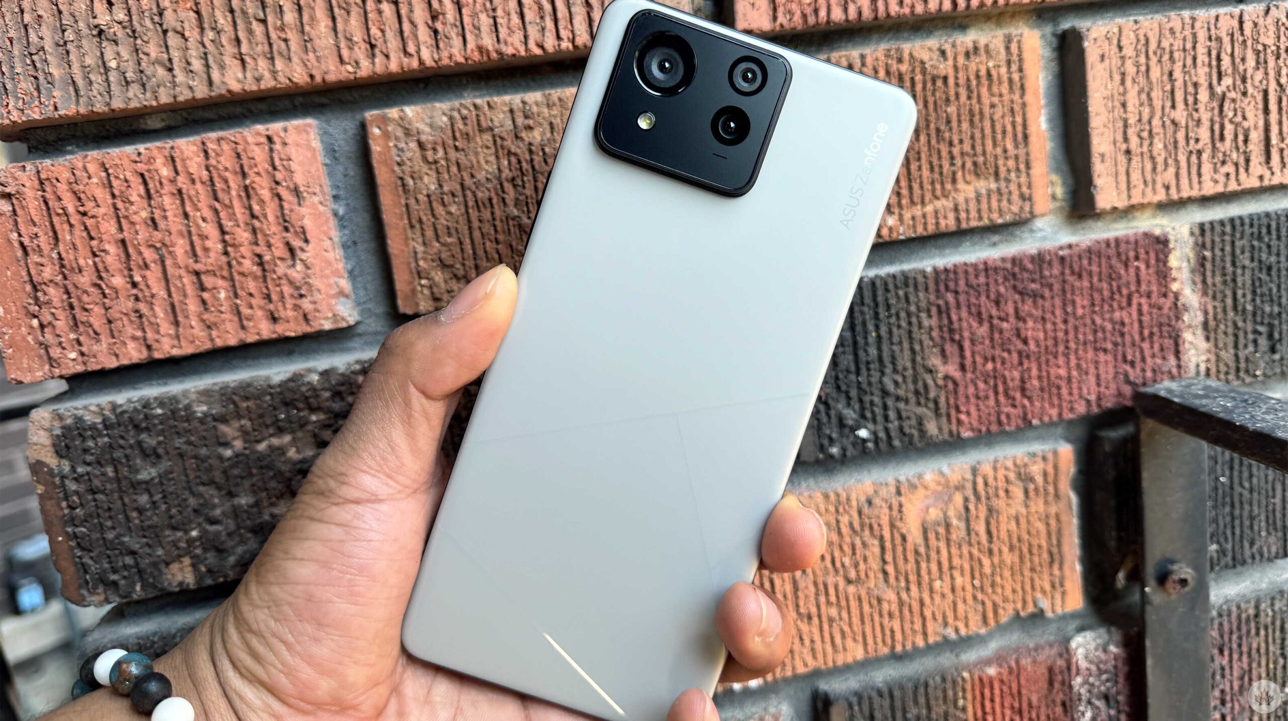
I was offered the opportunity to try the Asus Zenfone 11 Ultra, the Taiwanese company’s latest flagship. While the handset isn’t coming to Canada, I jumped at the chance to take the smartphone for a spin. I’ve been using the device for several weeks, and it’s been pretty enjoyable.
Since the handset isn’t coming to Canada, let’s list things you should know about the Zenfone 11 Ultra instead of a full review.
Specifications
The Zenfone 11 Ultra is pretty ‘ultra’ with its assortment of specs. These include 16GB of RAM, 512GB of storage, a 144Hz refresh rate display when gaming with a Snapdragon 8 Gen 3 processor and a 3.5mm headphone jack. The device also sports a 5,500mAh battery and 65W wired charging, which makes charging the handset very quick.
These specs made my experience with the handset run incredibly smoothly. I’ve watched many YouTube, Disney+ and Netflix videos, played tons of Marvel Snap, took quite a few notes on Google Keep, and scrolled through Instagram, TikTok and many other social media apps.
I also loved that the smartphone had a 3.5mm headphone jack; I think more devices should include this. Most people no longer have wired earbuds, but it’s always nice to be given the choice.
AI Everywhere
Artificial Intelligence (AI) is a hot smartphone topic, especially with companies like Google and Apple drinking the AI Kool-Aid.
The Zenfone 11 Ultra does have an interesting AI feature called ‘Semantic Search.’ Semantic Search lets people use more colloquial language when looking for something in their settings, apps, and more. For instance, you can type ‘phone usage’ to find details about battery usage.
Other AI features include ‘AI Noise Cancellation,’ which suppresses background noise when you’re on a phone call. There’s also an AI Call Translator, which lets users speak in their native language, and AI will translate their words into text and voice.
You can also play around with AI Wallpaper, which lets users make new wallpapers by using some keywords.
ZenUI
One of my favourite things about the Zenfone flagships is its user interface. When setting up your Zenfone 11 Ultra, you can choose between stock Android and Zen UI. I chose ZenUI, which has some exciting optimization features. The UI is bare compared to other brands like Samsung.
One of the ZenUI features allows users to pull down from the left or right side of the selfie camera. On the left side, you’ll see your notifications; on the right, you can see an expanded view of the Quick Settings. This is similar to how the latest iPhones work, and I think it’s a fun and nice touch.
Like Samsung phones, ZenUI lets users add apps and shortcuts to a menu on the edge of your display. Called Edge tool, you can add system shortcuts like the flashlight or take a screenshot, but you can also add apps, giving users quick access to your favourite apps.
A Smart Key option also turns the power button into a quick access for the Google Assistant or Voice input if you want to take notes or open any apps on your device.
Great battery
The Zenfone 11 Ultra features a rather large 5,500mah battery that’s very impressive. You can easily get a full day of battery and, by the end of the day, have 50 percent capacity remaining. For the most part, I’d charge it again overnight, but on the days I didn’t, I got partway through the following day.
If you hate carrying a portable charger, the ZenFone 11 Ultra is an awesome choice. Battery life is a big issue for many, so it’s great that Asus can provide a quick and powerful handset with an awesome battery.
Does size matter?
The Zenfone 11 Ultra features a 6.78-inch AMOLED display and is 163.8mm in length, 76.8mm in width and 8.9mm in thickness, weighing 224g. This is much heavier and bigger than the 172g ZenFone 10 with a 5.92-inch display and 146.5mm in length, 68.1mm in width and 9.4mm in thickness. The trend in the smartphone market is to make handsets bigger, such as the Galaxy S24 Ultra, Pixel 8 Pro and the iPhone 15 Pro Max and foldables; however, the ZenFone 10 was a nice option for those who like smaller smartphones.
The Zenfone 11 Ultra is big and matches the trend of larger devices. But since the ZenFone 8 back in 2021, Asus has been offering smaller devices. I think the ZenFone Ultra feels great to hold, and people seem to prefer larger smartphones, but it would have been nice if the tech maker offered a smaller size as well.
Average at best
The Zenfone 11 Ultra’s camera is probably the least favourable aspect of the smartphone. Its pictures are unexciting and overexposed enough to look pale and lifeless.
Some images can look pleasing, but there is a slight oversaturation in the colours, and some images look digitally enhanced. These pictures aren’t great, but they work for a quick social media post, especially if you’re not interested in photography.
Across the border
If you’re interested in the Zenfone 11 Ultra, I won’t blame you, but as I mentioned earlier, this phone isn’t coming to Canada. If you want to hop over to the U.S., the Zenfone 11 Ultra costs $899.99 USD (roughly $1,225 CAD).
MobileSyrup may earn a commission from purchases made via our links, which helps fund the journalism we provide free on our website. These links do not influence our editorial content. Support us here.
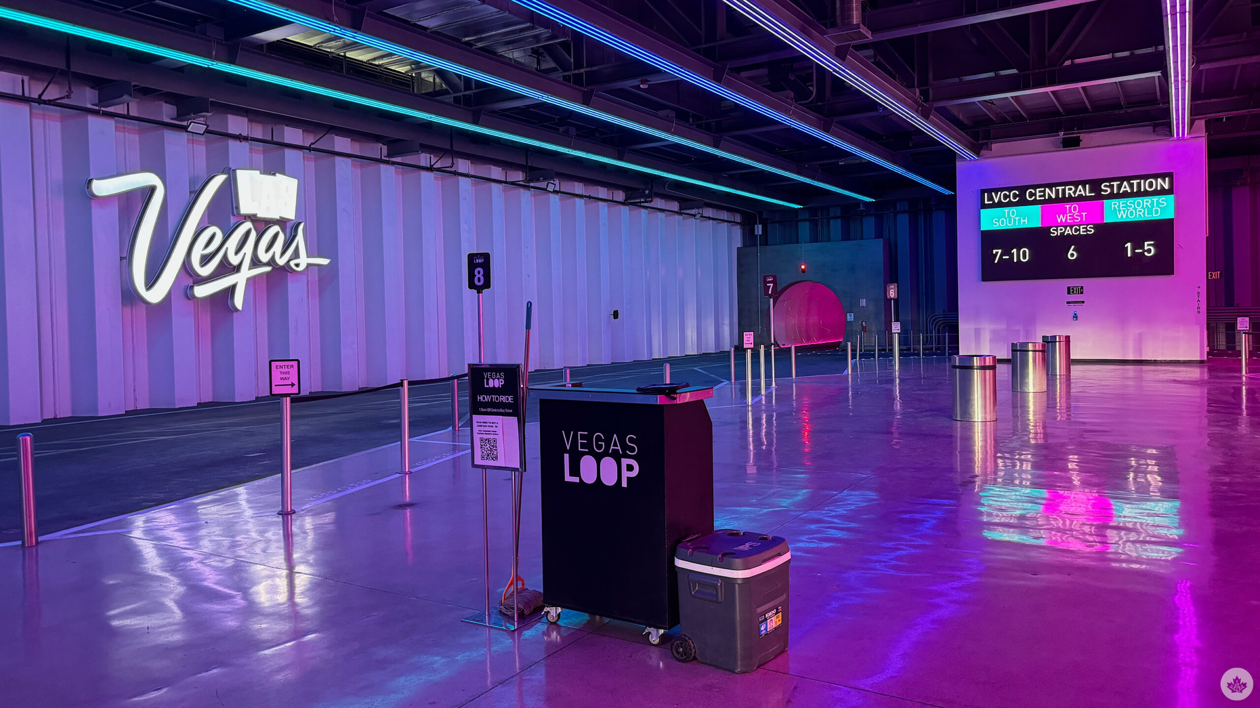
It often feels like it’s impossible to get around Las Vegas, Nevada.
Short distances that seem walkable at first take two to three times longer to navigate than expected due to the ample walkways, bridges, barriers and, of course, crowds. Ubers are costly, with surge pricing galore, and the monorail is slow and inefficient. Sure, you could take a taxi, but who actually wants to do that?
This is where Elon Musk’s The Boring Company’s $52.5 million USD (roughly $71.8 million CAD) Las Vegas Convention Center Loop (LVCC Loop) comes in. In the future, additional planned tunnels will connect the Las Vegas Airport and Downtown Las Vegas to the Las Vegas Convention Centre, totalling 30km (19 miles) in distance.
The Loop’s tunnels are undeniably cool.
But for now, the only operational tunnels connect the following: Resorts World Station, LVCC Rivieera Station, LVCC West Station, LVCC Central Station and LVCC South Station (the Resorts World Tunnel is single-lane and outside the rest of the stations’ dual one-way tunnel system).
The pricey Tesla tunnel is positioned as a quick, cost-effective way to get between convention centre halls, and in a sense, it fulfills that promise. $5 USD (roughly $6.80 CAD) gets you a day pass, so if you’re attending an event at the LVCC and need to move between halls quickly, this is far better than walking or jumping in the back of an Uber (the Loop can cut a 30-minute trip down to 2-5 minutes).
My brief tour of the Loop took me past every station.
Here’s how it works. You get into the Loop through small stations that look sort of like a Cyberpunk 2077-esque take on a subway station, complete with an escalator, fluorescent lights and glowing gamer-inspired pink and blue lights. I walked down to the neatest lane, showed my day pass and jumped in the back of the next Tesla Model Y/X.
My rather talkative driver told me several facts about the tunnel, including the lofty claim that the Loop will be capable of moving more than 90,000 passengers per hour to various locations along the city’s main strip when it’s complete. Is this accurate? Who knows.
Hell ya. pic.twitter.com/MQzxAnhvQa
— Patrick O’Rourke (@Patrick_ORourke) May 16, 2024
My driver also said that all tunnel drivers are contract workers and that as far as a side job goes, driving for Musk’s tunnel is a decent gig that pays pretty well. My driver went on to say that while vehicles operating in the tunnel are driven by people, the goal remains for them to be autonomous eventually.
The actual tunnels are futuristic and full of eye-catching neon lights. Speeds are limited in the tunnel, but you still get that classic electric vehicle acceleration jolt, which is admittedly pretty cool, especially in the confines of a tight tunnel.
My driver was surprisingly friendly and talkative (he also seemed to be Elon Musk’s number one fan).
It’s important to point out that the almost $53 million spent on the Loop could have been used to expand Las Vegas’ current public transportation system significantly. There are also no accommodations for those with disabilities, limiting the Loop’s usefulness. Most importantly, moving 1-3 people in underground tunnels is a wildly inefficient form of transportation, especially compared to the number of people a traditional subway system transports. From that perspective, moving cars underground through a one-way tunnel in an effort to solve Las Vegas’ traffic congestion issues doesn’t make much sense.
Still, the Loop got me from point A to point B quickly during rush hour, and the overall experience was pretty chill. I’m also a fan of the LED lights lining the tunnel (because who doesn’t like a little RGB in their transit?). However, I question if this project can really expand beyond its current limited scope and if it does, how much will that construction cost? Tunnels aren’t cheap.
Image credit: The Boring Company
Currently, Las Vegas’ Loop is a fun, futuristic way of getting around a very limited city area, but it feels more like a fun theme park ride than an actual transportation solution.
With all of that said, I’ll definitely take advantage of the Loop the next time I’m at CES.
MobileSyrup may earn a commission from purchases made via our links, which helps fund the journalism we provide free on our website. These links do not influence our editorial content. Support us here.
You loved our review of Tim Hortons pizza so much that we’re back with an in-depth, hands-on (or is it “mouth-on” or “taste buds-on?”) with McDonald’s latest creation, the Grimace Shake.
Let’s get into it:
Sickly sweet and sugar-filled
My key question regarding the Grimace Shake is how it canonically fits into the broader McDonald’s universe. Is the purple milkshake made from Grimace, the rotund purple creature of an undetermined species?
Is there more than one Grimace? Was a Grimace hurt to create the shake? Does the Grimace Shake consist of some sort of other fluid tied to everybody’s favourite monster? We’ll likely never know.
Does the Grimace Shake feature the purple creature’s soul condensed into a milkshake? We’ll likely never know.
I picked up my small Grimace Shake on my trip to the MobileSyrup office, alongside my favourite McDonald’s breakfast, a double-double coffee, a hashbrown, and a sausage and egg McMuffin. Given that it was 8:30am when I placed my order, I wasn’t surprised the employee taking it asked me to repeat myself three times.
But on to why you’re reading this review and my overall thoughts on the Grimace Shake. In short, I find it absolutely awful, and this is coming from someone who typically likes sweet food. Once I got past the off-putting purple colour, I was greeted with what I’d describe as a nauseating cotton candy taste that quickly gave me a headache.
It’s the definition of too much. I even found the shake’s blueberry smell overwhelming despite the taste being more in line with some form of melted candy.
After probably 5-10 sips, I was out and threw the remainder of the Grimace Shake in the garbage. This McDonald’s promotional stunt is not for me. I’ll stick with my standard vanilla McDonald’s milkshake, thanks. Hopefully, for Brad Shankar’s sake, he’ll enjoy the Grimace Shake far more than I did.
-Patrick O’Rourke
Better than it has any right to be
I didn’t know what to expect going into the Grimace Shake outside of the amusing meme videos of people trying the mysterious drink and then “dying.” If nothing else, it seemed like a logical move for McDonald’s, given how widely recognizable Grimace is for the brand. But of course, weird promotional stunts don’t always lead to the best products, so I went in with quite a bit of apprehension.
I have to say, though: the Grimace Shake is actually decent. As McDonald’s says on its website, the drink blends vanilla soft-serve ice cream with blueberry-flavoured syrup. Overall, it’s a solid mix, with the ice cream giving it a satisfying thickness while the syrup balances that out to give it a smooth consistency.
Check out that froth 😝.
I do wish, however, that it had a stronger taste. I normally love blueberries and similarly flavoured goods, but I prefer when they’re tart, and the Grimace Shake has more of an understated flavour. If I’m going to treat myself to a highly sugary drink, I want it to be more flavourful, especially when, in the case of the small size I went with, it’s a whopping 650 calories with 94g of sugar. For comparison, my go-to smoothie at Booster Juice, the Very Berry, is 280 calories with 50g of sugar. (Admittedly, though, that’s a few dollars more.) But even if we’re talking ordering just from McDonald’s, I’d still rather go with one of their normal fruit smoothies or, if I’m feeling ice cream, a McFlurry.
Ultimately, the Grimace Shake is a case of something being more compelling for the memes surrounding it than any of its own merits. On the flip side, this being a limited-time item means it’s something you’ll realistically only have once, anyway, so in that sense, it’s worth trying.
-Brad Shankar
The Grimace Shake is now available at McDonald’s locations across Canada for a limited time. You can get it in four sizes: Snack ($2), Small ($4.19), Medium ($4.89) and Large ($5.59). It can be ordered in-restaurant, at the drive-thru and through McDelivery. (You can also use the McDonald’s app, though it could rob you of $2,000.)
MobileSyrup may earn a commission from purchases made via our links, which helps fund the journalism we provide free on our website. These links do not influence our editorial content. Support us here.
In recent years, I haven’t played many multiplayer games.
Unfortunately, the market is so oversaturated with Destiny and Fortnite clones that I find myself growing wearier every time yet another new live service is announced. Publishers keep chasing this trend, and, more often than not, it doesn’t pay off — look no further than the $200 million loss Warner Bros. just took on Suicide Squad: Kill the Justice League.
Therefore, it takes a particularly unique hook for a multiplayer game to grab me. Most recently, that was Helldivers 2 for its satirical jingoism and riotously chaotic team-based shenanigans. Now? That game is Sea of Thieves.
While Rare’s pirate-themed action-adventure game has been available on Xbox and PC since 2018, it only recently came to PlayStation 5 as part of a larger multiplatform push from Microsoft. Going in, my experience with Sea of Thieves was limited outside of brief sessions during an Xbox One X event and the Series S review period. Beyond that, all I really knew is that, like most live service games, Sea of Thieves launched with a soft content offering that’s significantly expanded in the following years. So, I went in without much in the way of expectations and, lo and behold, I found myself quite enamoured with the whole experience.
The first big reason for that is the core premise. Simply put, a multiplayer pirate adventure game still feels incredibly novel, even more than five years after launch. The only real competition in that regard is Ubisoft’s recently released Skull & Bones, which is focused purely on the boat experience and garnered lukewarm reviews. Otherwise, Sea of Thieves‘ core gameplay loop — creating your own ship and pirate, venturing out into the ocean and exploring islands for treasure — still feels exceptionally fresh, especially amid the countless modern and futuristic shooters. Sea of Thieves‘ striking aesthetic, which mixes stylized, cartoonish character models with realistic lighting and water effects, only further differentiates it from other live services.
There’s also just an appealingly easy ‘pick-up-and-play’ nature to the whole thing. So many modern live services are all about sucking as many minutes and dollars out of you as possible, like Call of Duty ridiculously charging over $100 just to get King Kong’s robotic arm from Godzilla x Kong: The New Empire. Those sorts of games often bombard you with battle passes and other monetization schemes. All of this just makes the games feel more like a chore to me which defeats the entire purpose of entertainment. Sea of Thieves, however, avoids most of that. Sure, there is a ‘Plunder Pass,’ an optional premium purchase that offers various cosmetic rewards and in-game currencies, but I didn’t feel like it was being shoved down my throat as it would in other games.
Instead, Sea of Thieves has regular seasonal updates to incentivize you to return for new weapons, tools and the like. What I dig about this, though, is that the bigger content — namely, the big Monkey Island and Pirates of the Caribbean crossovers — actually remains in the game. Therefore, I don’t feel like I’m missing out on anything especially cool as I start playing several years later. Few things annoy me more than limited-time story content, especially when they involve crossovers. This is a problem with one of the only other multiplayer games I play, Final Fantasy XIV, where events themed around previous Final Fantasy games frustratingly come and go throughout the years.
But above all else, the pirate gameplay is just refreshingly different from anything else on the market. I love making my own goofily dressed adventurer with his own quirky pet and Final Fantasy airship-inspired boat. I love having to tend to the anchor, sails and wheel, especially in coordination with other players, which further adds to the authenticity of the pirate fantasy. I love naval battles where I have to frantically race below deck to get ammo, dash back up, load the cannons, aim and blast an opposing ship, all while my own vessel is shaking drastically from incoming fire. I love drinking grog and playing shanties with fellow pirates in fun, random online interactions. This all leads to a deeply compelling gameplay loop where all sorts of things can happen.
Take my experience last night. After exploring a harbour town with all sorts of colourful (albeit eerily unvoiced) figures, I hopped onto my ship and joined a pirate guild. My first mission had me venturing off far away, so I made sure to open my party for players. (You can play solo, although this locks you out of higher-tier rewards and a bunch of missions.) After all, I was still finding my footing after a brief tutorial. One person joined soon after, and, perhaps noticing I’m a greenhorn, handled the piloting of the ship. This allowed me to truly soak in the crisply rendered water and stunning dynamic weather system. The ambience of sailing through a storm, with the ship violently rocking left and right as you’re hit with howling winds and bucketing rain, is particularly impressive.
Eventually, though, he left, leaving me to go the rest of the way until another person joined. As it turns out, the whole time I was going towards a skull cloud, which I mistakenly thought was a marker for my quest, given that the tutorial (somewhat annoyingly) doesn’t explain a whole lot of this. Instead, it’s part of Sea of Thieves‘ raid system, which has you sailing to mysterious islands to fight hordes of undead creatures, including super boss captains, for rare treasure.
Right away, I was taken aback at how difficult this was, especially as several skeletons kept chasing me with exploding barrels. My teammate and I alternated between dying until a third player, who was clearly more of a veteran, joined our crew and quickly started guiding us. Given that we were bleeding through resources to fight these creatures and feeling like we had no hope of winning, his arrival felt as rousing as Thor’s grand Wakanda rescue in Avengers: Infinity War.
With his leadership, my two crewmates stayed on the ship to lob cannons at the fiery skeleton lord and his minions while I distracted them on the beach. Before long, victory came at last! But it was also fleeting, as two other human crews arrived at the inlet, no doubt hoping to steal our loot. Unfortunately, I didn’t notice them right away (since I wasn’t using a mic, I was still figuring out the in-game warnings teammates can send you) and so my teammates had already gotten in the ship to sail around the island to keep the teams at bay.
Amid this chaotic At World’sEnd-like skirmish, I pranced around the island like Jack Sparrow, desperately trying to find anything I could do to help. (I also wasn’t able to find the mermaid who could automatically return me to my ship before an enemy cannon sent me to my doom.) Once I was back on my ship, I helped patch up leaking holes and scoop out buckets of water while the others dealt with our opponents. But no sooner did I return to the deck and realize that one of the other teams had already been sunk did the remaining team launch harpoons at our ship, creating handy tightropes to board us. Just as we managed to sink the second and final enemy ship, the enemies had successfully set fire to ours, causing critical damage and sending usall to our graves. Well played.
All told, that was maybe one hour of thoroughly entertaining — and completely unplanned — gameplay, and it was with randoms and no mic, no less. But it’s also the kind of white-knuckle thrills you can expect from Sea of Thieves, and it would no doubt be even more exciting with a party of friends. And with full cross-play enabled, PS5 players will be able to hit the seas with those on Xbox and PC for even more adventures.
Hopefully, that even larger player base keeps Sea of Thieves going for a long while, because after the rollicking good time I’ve already had, I’m eager to get back to adventuring with people. A pirate’s life for me, indeed.
Sea of Thieves is now available on PlayStation 5, Xbox One, Xbox Series X/S and PC. It’s also included with Game Pass on Xbox and PC.
Image credit: Rare
MobileSyrup may earn a commission from purchases made via our links, which helps fund the journalism we provide free on our website. These links do not influence our editorial content. Support us here.
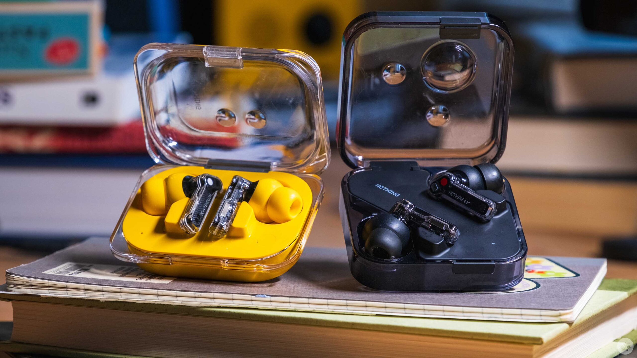
At first glance, Nothing’s latest and greatest earbuds seem perfect. I mean, look at them! The company refuses to be beaten when it comes to hardware design, and three years in, they’re just as expressive as day one.
This year there are two models – The top-end Nothing Ear and the cost-efficient Ear (a). Both improve on previous Nothing earbuds in key ways like battery life, noise-cancelling and microphones, but when it comes to sound quality, the changes are less notable compared to the Nothing Ear (2). But don’t take that as a slight, Nothing came a long way with with sound tuning last year, so there’s little to scoff at with the new buds.
The first few days of the Ear (a)
After unboxing both of the new earbuds, I was of course, drawn to the new Nothing Ear (a) and its exciting yellow colour. Who can blame me?
Once I inserted them into my ears, I was impressed with the sound quality. Music sounded full and robust with strong mids. After a little more listening I ended up switching to the smaller ear tips that were included in the box. After that, the earbuds fit much more snugly in my ears. This surprised me a little bit since I’ve typically been fine with medium earbud tips from most brands, including Nothing in the past. On top of that, the Nothing Buds are pretty much the same dimensions as my AirPods Pros, but all I can say is that the small option but less pressure on the insides of my ears.
The Ear (a) has a new case which Nothing says is inspired by the packaging for pills. It’s a cool bubble effect, and at the same time, it slims down the earbuds to make the whole package a little more pocketable than existing Nothing earbuds with square cases. The trade-off of course, is that the Ear (a) doesn’t get a wireless charging pad. That said, I don’t think this is a big deal since a quick ten-minute charge will give you ten hours of battery life.
One last thing to note is that the plastic for the Ear (a) will scratch if you take off the clear sticker it’s packaged with. I quickly removed the sticker because it made the design look cheap. That said in my time testing the buds, the clear plastic on top held up pretty nicely. The yellow plastic on the bottom got way more scratched, but it’s something I noticed less. I’ll also mention that opening the Ear (a) with one hand is easier than the Ear.
Overall, the simplicity of the case highlights the buds and even though these might be the cheaper of the two Nothing buds, I think these look better even if the other Nothing buds offer more features.
Moving up to the Ear
The Nothing Ear is the less flashy of the two new buds, but it retains Nothing’s award-winning design and adds in the most features. Most notably, these include wireless charging, a ceramic speaker driver and IP55 water/dust proofing on the case.
The Nothing Ear sounds marginally better than the Ear (a), but I don’t expect the difference to be noticeable for most people. They’re ever so slightly crisper due to the ceramic driver as opposed to the hard plastic one in the Ear (a), but without directly comparing them, it’s really hard to spot differences.
Where the Ear really sets itself apart is with software. In the Nothing X app, you can get much more control over the EQ, and there is even software built into the app to help personalize the sound profile to your hearing. This mode basically plays sounds at lower and lower volumes, and once it figures out what frequencies you struggle to hear, it boosts them. It’s subtle but a nice touch.
At the end of the day, most of what makes the Nothing Buds good is the solid sound quality and great design, which can be found on the Ear (a) for cheaper.
The Nothing app and software
One aspect of the Nothing X app (iOS/Android) I’d love to see improved is adding controls right on the main screen. Sure, it looks cool to have a giant image of my own earbuds taking up most of the app, but if it was four times smaller, we could probably fit most of the options hidden behind the menus on one page. Most of the time, I open the app to toggle noise-canceling or EQ anyway, so it’s annoying those controls are buried under a menu.
Speaking of active noise cancellation (ANC), both earbuds have the same ‘Adaptive’ mode that the Nothing Ear (2) launched with. This means it can intelligently modulate from low to high ANC, which might help you save a tiny bit of battery life. However, stacked up against Apple’s smart adaptive noise canceling, it’s not nearly as effective or smart. This led me to mainly just keep the buds on ‘high’ ANC pretty much the whole time I used both buds.
One small note is that Nothing has great attention to detail and the sounds to signify transitioning between ANC and transparency mode are pretty cool and do a good job of signifying what mode you’re in. There’s a deep drum thud for ANC and a deep breath sound for when you enter into transparency.
You can also customize the pinch controls in the app, but out of the box, they’re setup as you’d expect. The only one that needs to be added is a double-pinch-and-hold gesture that can be used to trigger Google Assistant or Siri. If you have a Nothing Phone, you can also set this to work with Chat-GPT, but you can only ask it general questions. If you want an assistant that can play music or interact with your phone, you’re better off with Siri or Google.
A few weeks later
Overall both, the Nothing Ear (a) and the Nothing Ear held up really well over my long term testing and in the end, it’s honestly really hard to tell them apart. I sometimes feel like the sound from the Nothing Ear is a little fuller, but at the same time, I have no complaints about the Ear (a) and day-to-day, I like its smaller case size.
As expected both Nothing buds were extremely functional and well-tuned. However, compared to my AirPods, I still found the Nothing buds sometimes disconnect when I’m wearing them out and about in the city. It’s not something that happens all the time, but the few times it did were quite frustrating. It wouldn’t fully disconnect either. In most cases, the audio would lag or get distorted for a bit, then come back normally. At first, I thought this was because I had a backpack on with my laptop or iPad in it, but it’s happened many other times so at this point, it just feels like the connection isn’t as strong as I need it to be.
This didn’t stop me from using the buds since a quick pop back in the case often fixed the issue and at the end of the day this is a sometimes common earbud issue. It’s happened less, but sometimes even my AirPods bug out and need a soft reset in the case. Nothing released a software update that has improved the transparency mode considerably. During my first week of testing,it was really low-res and had consistent static, but post-update, both earbuds are much better at relaying the world around me through their mics. Hopefully, Nothing can continue to update these buds so the connection gets stronger too.
Most will be more than happy with the Nothing Ear (a). The overall quality of the earbuds and case feels very similar to the Ear, while costing $50 less in Canada. It’s a good trade-off that’s easily worth it for most people. If you have Tidal or Apple Music and you want to try and get the most out of your subscription, the Ear promises a slightly better listening experience.
You can buy Nothing earbuds on the company’s website. The Ear (a) is $150 and the Ear is $200.
MobileSyrup may earn a commission from purchases made via our links, which helps fund the journalism we provide free on our website. These links do not influence our editorial content. Support us here.
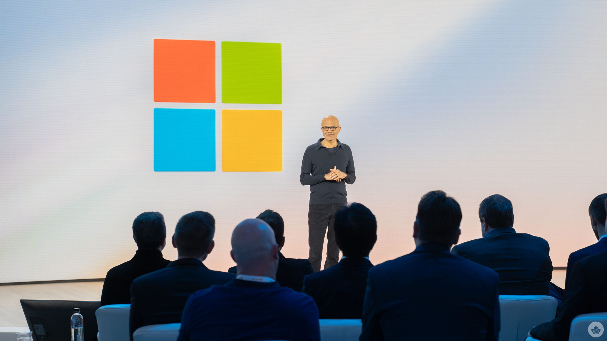
Microsoft held a Surface and AI event ahead of its 2024 Build conference in Seattle, Washington, where the company finally revealed new Surface Laptops and a Surface Pro.
The anticipated new devices sport Qualcomm’s much-hyped Snapdragon X Elite chip as well as the slightly less powerful X Plus chip.
Microsoft also announced ‘Copilot + PC,’ new branding to highlight AI-capable PCs. Microsoft said this new category of PCs are totally revamped, offering super thin designs while still being the “most powerful PCs in the world.” The performance relies on a new architecture that combines CPU, GPU and Neural Processing Unit (NPU), which can achieve over 40 trillion operations per second.
The Surface Laptop comes in two sizes like before, with 13.8- and 15-inch display options. Microsoft also revamped the laptop’s design, making it more modern, slimming the bezels and adding an AI-enhanced camera and haptic touchpad.
As for the Surface Pro, it has a new OLED with HDR display option, ultrawide camera, and a new Surface Pro Flex keyboard. The Flex Keyboard can be used connected or disconnected to the Surface Pro, allowing for more flexible input options.
The company said its new Surface Laptop is up to 80 percent faster than its predecessors while also boasting the longest battery life on any Surface PC. It’s also more efficient, achieving the same peak performance while draining half as much battery. Microsoft says the new Surfaces double the battery life of previous Surfaces.
Microsoft also did a live Photoshop demo comparing a new Surface Laptop to a MacBook Air with M3 (the laptops otherwise feature the same specs) that showed the Surface Laptop processing images nearly two times faster than the MacBook. Adobe’s apps are also coming to Copilot + PCs available today or coming soon. The company also said it partnered with Blackmagic to offload some DaVinci Resolve features onto the NPU to help boost performance.
Microsoft says its Surface Pro 9 is up to 90 percent faster than its predecessors.
Both new Surface devices feature Wi-Fi 7.
The company said Copilot + PCs sport significant improvements thanks to a huge leap in compute performance. Microsoft is working closely with Intel, AMD and Qualcomm to achieve higher performance. Microsoft claimed that Copilot + PCs running on Qualcomm’s Snapdragon X Elite chip are significantly faster than Apple’s M3 chip, including up to 58 percent better sustained multithreaded performance. There’s also Prism, a new ARM translation layer for Windows.
Copilot improvements
Microsoft detailed some improvements coming to Copilot as well, such as turning it into a more app-like experience that can be resized and repositioned. Additionally, Windows users will be able to drag and drop between other apps and Copilot. OpenAI’s GPT-4o will also make its way into Copilot. Microsoft showed a demo of someone playing Minecraft while Copilot speaks to them and teaches them how to play the game.
Later, Microsoft detailed Copilot Vision to help gamers in-game by allowing them to ask questions. For example, while flying in Microsoft Flight Simulator, gamers could summon Copilot to ask where the nearest airport is so they can land their plane.
Another feature Microsoft highlighted was ‘Recall,’ which leverages AI and the improved system performance to help people find things they were doing on their PC. Recall will only be available on the Copilot + PC devices. Recall can help people find documents, websites, conversations and more, and can even work based on little details, such as mentioning that the document had purple writing.
Microsoft says Recall will stay on-device and the company won’t use any of the data for AI training. Recall leverages several small models that are built into Windows, allowing the AI to work efficiently in Windows and across all apps. Microsoft said Recall builds a “semantic index” with context-based information to power Recall. There’s also Windows Copilot Runtime, which is a new layer of Windows 11 comprised of over 40 AI models.
The company teased other AI features like Live Captions, the ability for Copilot to draw and sketch with users and more. The Photos app will also gain the ability to restore old photos with AI-powered super resolution and other capabilities.
Another demo Microsoft showed on stage was Cocreator running on the new Surface Pro. Cocreator allows people to put in a prompt and also sketch while AI model pull from the sketch and text prompt to generate a picture. Users can adjust how much input the AI models have on the final result. Because Cocreator leverages the NPU and runs locally, it’s much faster and doesn’t require tokens or a premium subscription.
More to come…
MobileSyrup may earn a commission from purchases made via our links, which helps fund the journalism we provide free on our website. These links do not influence our editorial content. Support us here.