I recently made the switch from a TV to a projector and while having a giant screen at home might sound like the perfect experience, there are way more trade-offs that I wasn’t aware of when I set it up.
Don’t get me wrong, having a giant screen is an incredible experience and the projector I used is fantastic, but I’ve learned that you really want to be able to permanently set up a projector since taking it down and putting it back up every time you want to watch something is a pain.
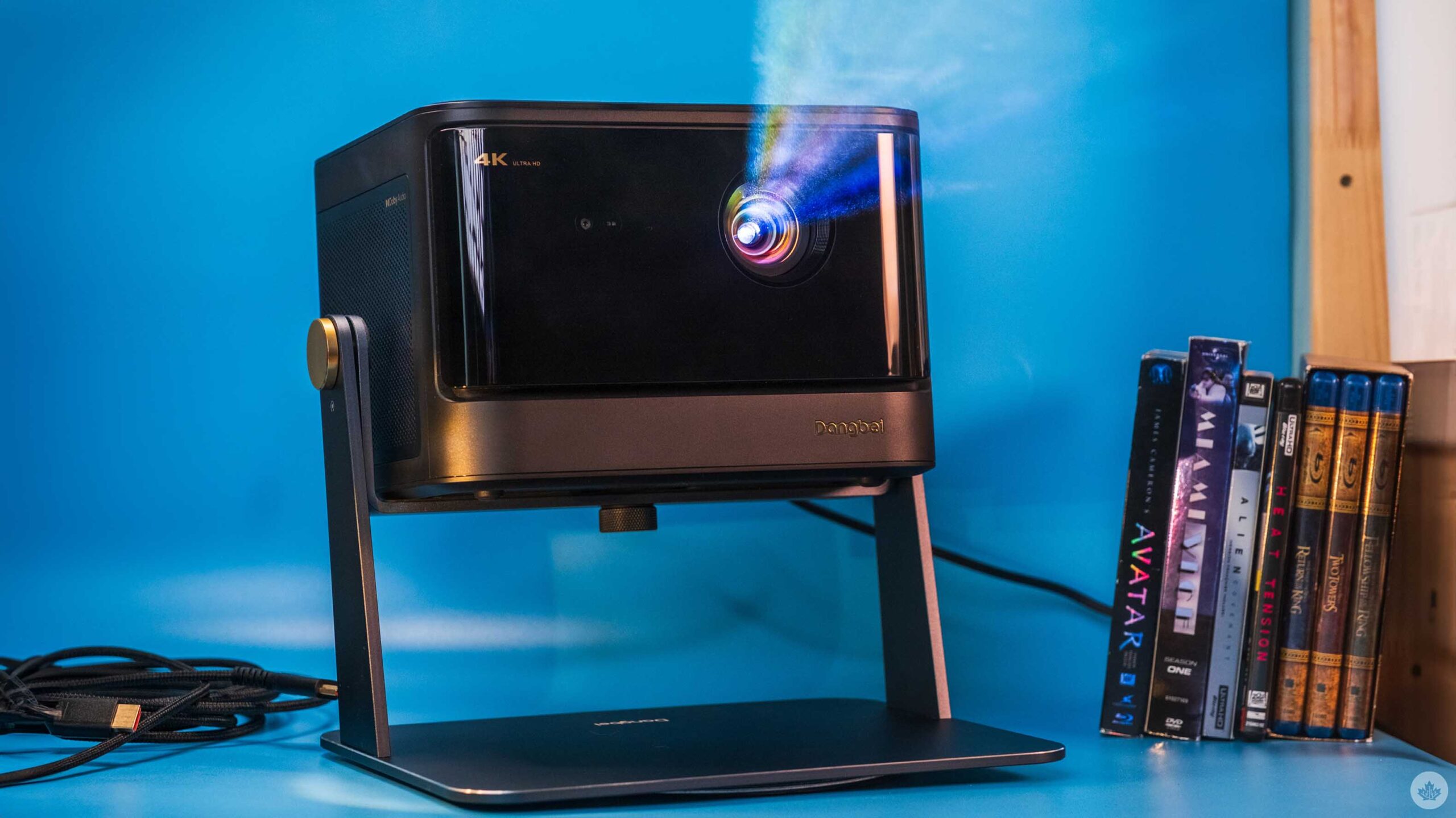
What projector I used
I was lucky enough to get my hands on the Dangbei DBOX02 4K laser projector, and it’s been stunning. The unit can project a 4K screen up to 200-inches and has a peak brightness of 2,450 ISO lumens. It also has built-in speakers and 2 HDMI ports and runs Google TV.
There are also two USB ports on the back, an Ethernet jack, optical audio and a headphone jack.
Overall, this is a pretty big and bulky projector, but it provides a really clear and bright image that I find is worth the trade-off. It’s also one of the few projectors that’s “Netflix approved,” which just means that it’s bright and has pretty good colour reproduction.
Since it’s a projector it also gets quite hot, but the fans inside are quiet and after using it for a few weeks I’ve never heard the fans kick onto high. All in all, it’s an impressive unit, but integrating it into my home has been a struggle.
Setting it up

Luckily my living room is pretty dark by default. With light from a nearby window the projector is not as washed out as you’d expect.
The first thing you need to know about my living room (where I watch all my TV) is that I have a fairly vintage wallpaper pattern. While I thought it was fun when I moved in, It does mean I need a screen to be able to watch content. Beyond that, there are two large windows in my living room and only one of them has curtains on it — at least part of it. There’s also a large stained glass portion above it that’s not covered.
While the marketing claims you can watch TV during the day with the DBOX02, in reality, it’s pretty washed out when the lights are on. It’s possible, but I assume if you’re a movie nerd who’s going down the projector rabbit hole, you want the picture to look as good as possible. That means you need to watch in a dark room. So if I’m watching something before the sun goes down, I need to hang a sound blanket over one window and stack some cushions from a little bench in my living room to cover the stained glass. Someday I’ll install blackout curtains, but for now, I mainly watch at night.
The next hurdle in setting up your projector is placing it in the perfect spot. Since the projector needs to be as far away from the screen as possible, most people will need to find some way to either hang it from their ceilings or place it behind where they sit. I decided to place mine behind my couch, but that required me to buy a projector stand. This is basically a tripod with only one leg and a really heavy base to make sure the projector doesn’t tip over. However, I will say the DBOX02 is pretty heavy so the stand does wobble a bit. It’s also just tall enough to see over me perfectly, so if I sit in the centre of my couch and lean forward to grad something from the table, you can see the shadow of the top of my head.
It’s also worth pointing out that the higher you raise the projector above the height of the screen, the more offset the picture will be. You can offset this in the settings with something called ‘Key-stoning’ but this only affects the picture, not the light output. This means for me that while I have a nice rectangular screen to watch, the light around it is more like a trapezoid. Lots of people paint the area around their projector screens a dark colour to absorb some of this light overshine effect, but since I rent that wasn’t an option for me. Most of the time it’s unnoticeable, but in dark scenes it sometimes makes it look like the screen is out of whack.

Now the final piece of the puzzle is the actual screen. If you have a white wall you can start with that, but if you don’t, you’ll need to buy a screen. I was able to bootleg a screen together from some old seamless paper, chandelier chains and a long section of PVC pipe. This was cheaper than a real screen, but only slightly, and the paper doesn’t sit as flat as I wanted. This looks fine for most things, but sometimes, when the camera pans in a scene, the subtle warping in the paper can make the pan look weird. It’s something I can look past, but I’ve been trying to find a way to flatten the paper to alleviate it.
That wasn’t all I needed, either. Since the projector now sits behind me, I had to get a 20-foot HDMI cable to connect it to my game consoles or soundbar, depending on what I wanted to do.
Overall, I went cheap with my setup and it still cost me over $200 to get the screen, stand and HDMI cable. If I would have gotten a real screen and actual blackout curtains I think I’d be closer to $400 in setup costs. If I really had my way, I’d paint the room a darker colour, especially the ceiling to help cut down on light reflections in the room. This would make the end picture look better, but again, it would be another couple hundred dollars and a lot of labour.
Am I going to be a projector guy now?

Honestly, for all these pain points, I’m still in love with DBOX02 projector. Having a giant 115-inch screen in my living room is amazing. Sure, it’s a hassle to set up and use with my soundbar, but at the end of the day, once the lights go off, the movie watching experience it provides is stellar and, in a lot of ways, more fun. It’s hard to describe but there’s something about the giant screen that just makes me want to make some popcorn and pay more attention to the screen than my TV.
I was also worried about lag for gaming, but I found it to be still very playable. Hardcore gamers are likely going to upset by the minimal lag, but I think people who play mostly console single-player games will be fine. Honestly, Ghost of Tsushima looks amazing when blown up on a giant screen.
Beyond that, I have been using the built-in speakers on the DBOX02 and, while it is weird to have the main audio come from behind you, they perform quite well and have a pretty good stereo separation. They also get loud, but I’ve found that since the speaker is right behind my head now, I don’t need to run it as loud as when I use the soundbar across the room in front of the screen.
I’ve also been using the projector connected to my Apple TV 4K, but it does run Google TV which I’ve only tested a bit. To be honest, I found the startup time to get to the basic apps was pretty slow and so most often I would switch it to the Apple TV input as fast as possible. However, I did need to use the built-in Google interface to set focus on the projector and to keystone my screen and both features were easy to use and understand. There’s even a button on the remote to quickly autofocus the projector. It would have been great for this to take users to the focus/keystone menu and let them choose which feature they need.
Overall, I think I’m going to stick with the projector for the time being since I love watching movies and TV on the giant screen. If you’re looking into getting one make sure you tally up all the accessories you’ll need and find a nice place to put it. If you can fit it into your life it’s definitely worth it.
You can check out the DBOX02 projector on Dangbei’s website. It retails for $1,499 USD (roughly $2,054 CAD). You can also get it on Amazon.ca where it’s listed for $2,600.
MobileSyrup may earn a commission from purchases made via our links, which helps fund the journalism we provide free on our website. These links do not influence our editorial content. Support us here.